QuickWrap
Charts > Column Chart
Page.tsx
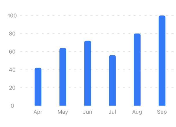
Similar to a bar chart but vertical instead of horizontal, making it ideal for grouping data by months, weeks, or categories. Use it for sales per month, project progress, or spending breakdown. It’s great when comparing multiple groups!